

8 Design Best Practices Every WordPress Developer Should Use
In a perfect world, every WordPress developer would have access to their own crack team of designers and front-end developers, leaving them free to get their hands dirty with the code they love. However, if you’re a one-man/woman WordPress developer, most clients will see you as a one-man army. Not infrequently, clients will make design choices you might not be comfortable with tackling. Like it or not, design is a crucial aspect of every web development project. It doesn’t matter how elegant your code is if the layout sucks. In this article, I take an in-depth look at eight design best practices a WordPress developer should know. (Note: my company, EstatesOnLine, has over 100 co-developers, as we’re always working multiple projects. It’s a business, after all!)
1. Keep up with Current Design Trends
Most WordPress developers are probably already familiar with what’s hot purely by virtue of general web browsing. However, it’s well worthwhile taking the extra effort to deliberately investigate major trends in order to stay current. Topping the “Most Used” list these days is parallax scrolling: a simple but effective motion design technique where foreground images move faster than those in the background. This creates an eye-catching effect, is easy to implement and lends depth and visual interest to the design of pages. You’ll see this effect employed quite often to make headlines really pop and draw readers in. Parallax is just a single trend highlighting the overarching scroll-heavy focus of much of today’s design. Infinite scrolling is another popular, though mildly controversial, technique.

Scrolling techniques in action at I Hate Tomatoes.
Another current trend that rewards close study is material design: Google’s attempt to create a cohesive visual language across their products and services. Material design is focused on providing a seamless design experience regardless of platform, with a mobile-first mindset.

Android’s homepage keeps up with material design trends.
Moving along, we come to card-based design (of which Pinterest is a classic example), a technique with an emphasis on the elegant visual display of condensed information. These trends are so popular because they create visual engagement by following a simple set of good design rules. We’ll touch on many of these rules as we go through the rest of our list. Getting familiar with current trends, like the ones we’ve highlighted, is a great way of turbo-charging your learning and almost instantly improving your overall design sensibility.
2. Commit to Responsive Design

Responsive design in action on an iPad view of Smashing Magazine.
Responsive design simply involves the ability to appropriately adjust to every user’s screen size, device orientation and platform. In a mobile-first world, it’s an absolute requirement for modern sites on the front end but can often feel like a duct-taped nightmare of media queries and assorted hacks under the covers. There’s no getting away from it though: users rightly expect websites and apps to display and function flawlessly across myriad devices. As a developer, you know that a seamless experience across platforms requires a lot of testing and fixing, but that’s no excuse to slack off. To underline how important this is, overlooking this crucial design element means you could be kissing goodbye to a third of website traffic. Implementing responsive design needn’t be a daunting task however, and developers these days have it much easier than even a couple of years ago in this regard. Make sure you’re getting this right and not sabotaging your designs for a considerable part of your audience.
3. Make Content Easily Accessible
Bounce rates vary wildly across websites, but one of the uncomfortable truths of online design is that a large number of people will be hitting your carefully constructed content and heading straight for the virtual door. People make astonishingly quick decisions about whether to stay on a site or not, and your job as a designer is to make it as appealing as possible for them to linger and look around. Poor layout choices, lack of search options and plain old irrelevant or low-quality content are all things that will send visitors packing. From a design standpoint, you want users to be able to quickly determine which part of your website holds the information they seek. Keep the navigation friendly and label everything clearly to avoid confusion.
4. Remember That White Space Is Your Friend

Cultured Code is a great example of good white space use.
By the nature of their work, developers are an organized bunch most of the time. More often than not, however, they are optimizing for efficiency rather than aesthetics. This is why they often tend to treat websites like old-timey newspapers – filled to the brim with information, but a nightmare for users to actually consume. You want users to be naturally visually drawn to the most important information in any section of your website. Effective use of white space is one of the most elegant and time-tested ways of doing this. Not only does white space serve to highlight important information, it also improves reading comprehension and makes your overall design look substantially sleeker. Add it to your arsenal of design tricks and your sites will instantly start looking more polished.
5. Understand the Importance of Fonts

Image by Olga Milagros / shutterstock.com
In design terms, fonts are a very big deal indeed. There’s a reason designers don’t just slap everything up in Comic Sans or Courier and call it a day. Unless you’re running a gallery-based portfolio, the chances are that the vast majority of the content of your projects will be in text form. In the bad old days, you could only choose from a limited set of fonts while doing web design, but those days are thankfully gone. Browser support for web fonts means that you’re now only limited by how much time you want to spend finding the perfect font fit for your site. An ideal font will not take attention away from the content itself, or look out of place in the overall design. Choosing fonts and font pairings is a design decision that rewards careful thought. Begin with a simple typographic primer, such as Matthew Butterick’s Typography for Lawyers, and you’ll feel those design muscles starting to flex straightaway.
6. Don’t Make Forms Difficult
Nobody likes filling in forms. Whether online or offline, they’re a chore. There’s no getting around them in web design though; they’re the main way users interact with your site: registrations, lost password recoveries, contact pages, submissions – the list goes on. Taking a little bit of extra time and effort to actually make your forms intuitively usable, friendly and stylishly presented instantly raises the overall design profile of your pages. You’ve got a slight advantage as a developer here as well. Many designers instinctively shy away from the technical side of implementing forms, but it should be relatively trivial compared to some of the other problems you’re used to wrestling with daily.
7. Provide Friendly 404 Pages

Reddit’s error page design, simple and informative.
Every website breaks or goes down eventually, even if only for short periods of time. While that’s to be expected, regular users often take this as a sign that your website shouldn’t be trusted, so why not take a bit of extra time in order to build a unique error page to reassure them? Anything looks better than a default server error message on a white page. A well-designed error page reassures visitors and gives the impression that everything is under control and things will be back to normal soon. When using WordPress, there are a lot of great plugins that can help you set up a custom 404 page with little effort. You’ll find a great breakdown of these in our article on the 7 Best 404 Plugins for WordPress.
8. Accept That Small Details Are Important
So far we’ve covered basic design trends, responsiveness, accessibility, using white space to your advantage, typography, forms and 404 page designs, but we’re still only scratching the surface of all the elements you could consider in terms of raising your design game. If you take away nothing else from our article, remember this: design is all about detail. Considered in isolation, all these small points don’t amount to much but, as they are all piled on top of each other, they form a cohesive whole that people instinctively recognize as good design. As a developer, you’re used to focusing on details in a very different context, but they’re equally important in this arena. Recognizing that truth goes a long way towards making you a better designer.
Summary
As much as great content, all of the points we’ve discussed lay the foundation for solid design. Using them will considerably improve the look and feel of any sites you happen to be working on. Let’s run through the list one more time:
- Keep up with current design trends.
- Commit to responsive design.
- Make content easily accessible.
- Remember that white space is your friend.
- Understand the importance of fonts.
- Don’t make forms difficult.
- Provide friendly 404 pages.
- Accept that small details are important.
Here at EstatesOnLine, we’re up-to-date with the latest techniques and technologies. When choosing a WordPress developer for your next project, why not choose us?
 WordPress is a fully customizable content management system and offers a unique platform that can be easily altered for any need and requirements. With the huge number of our experienced professionals, working on this demanding platform, you can anticipate premier quality solutions from us. WordPress administrator panel offers you an ultimate option to maneuver your website.
 Among the various shopping cart solutions available nowadays, the eCommerce shopping cart software OpenCart is indeed the most user-friendly tool known. Besides offering a simple-to-use yet visually appealing interface to e-commerce portals, it provides almost everything to transform a simple e-commerce site into a sales-attracting one. Following are the benefits it offers
 Estatesonline is a leading web design and development company providing effective e-commerce solutions to global clients. We combine our industry experience and technical skills to provide state of the art e-commerce solutions that help our clients reap maximum benefits from their Internet investment.
 JavaScript-based technology, MEAN stack is widely used by developers to build hybrid and feature-rich web apps. It is the combination of four powerful software development components that are MongoDB, Express.js, Angular JS and Node.js. These software components can be used effectively to design front end and back end development. It can improve the functionality of your website or app.


 Joomla, a power packed content management system (CMS) is loaded with award-winning features. It enables the developers to build dynamic websites and business-centric online applications. Whether you need to create a highly complex website or an enterprise level solution, Joomla has thousands of free plugins and beautiful templates to meet your personalized business needs.

 At EstatesOnLine, you’ll find knowledgeable, experienced Drupal developers for rendering truly out of the world CMS solutions to businesses – both big and small. We have the technical knack and right skills to exploit the powerful and friendly content management platform known as Drupal for building virtually any kind of website for representing your business on the web.
 HTML is great.for declaring static documents, however, when we use HTML for declaring dynamic views in web apps, it falters. Even other frameworks are unable to address the root issue that HTML is not meant for dynamic views. Luckily, AngularJS enables you to extend HTML vocabulary for your web app, thus providing an environment that is extraordinarily expressive and quick to develop. It serves as a tool-set for creating the framework that is most suited to your web app development. This fully extensible tool-set works nicely with other libraries and allows features to be modified/replaced according to your unique development workflow.
 EstatesOnLine is leading name in Symfony Web Development services. Symfony, one of the oldest PHP frameworks, has proved its importance over the years. We have a dedicated team of Symfony developers to meet your projects’ requirements in the most efficient manner. As a Symfony web development company, we do not leave a single stone unturned in delivering competitive edge applications based on this demanding PHP framework. Our developers have in-depth expertise in developing Symfony2 web applications.
 CakePHP has been a favorite for businesses due to its exceptional features & ease of use. If you are looking for the best CakePHP development services that can provide custom CakePHP solutions tailored to your requirements, then your search ends here.
 Being one of the best open-source PHP based web app frameworks, Laravel development is quicker and blessed with MVC architectural pattern. Laravel has been recognized as one of the best frameworks for the development of high-quality websites and trending web applications. This framework is most suitable for developing high performing and creative web apps to meet customized business requirements.
 A leading name in the CodeIgniter web development services, EstatesOnLine is committed to offering appealing and secure websites using the CodeIgniter framework. With years of experience and diversity in PHP-based projects, our CodeIgniter development team is dedicated to implementing the powerful features of this demanding PHP framework in delivering business-oriented web applications.
 Yii is a high-performance, secure and feature-rich PHP framework, used especially for the creation of Web 2.0 applications. It is an object-oriented programming platform having incredible features like MVC, DAO/ActiveRecord, web services, scaffolding, automatic code generation, error handling, role-based access control, and much more that can effectively reduce development time and increase business productivity.
 Powered by Microsoft technology, SharePoint is one of the finest web application development platforms that can be used to develop a full-featured content management system, solid intranet portals, multilingual enterprise solution, and business intelligence; including system integration and process integration. At EstatesOnLine, we are experienced in delivering the best Microsoft SharePoint Development services to global clients.
 Zend has become one of the most popular PHP frameworks. With the increasing popularity of Zend framework, there has been a tremendous demand for expert Zend framework developers. Developers at EstatesOnLine, have years of expertise in Zend framework development. We are a dedicated destination for Zend development services. With our proficiency in being a client-oriented Zend development company, we are now a leading name in the industry.
 Python is one of the finest and most easily readable programming languages that can be integrated easily with other powerful platforms. This platform allows professionals to express core concepts just in fewer lines of code. It is integrated with a dynamic type system and automated memory management. Our team of software professionals provides modern programming solutions in the Python programming language. Our Python-based solutions help our clients achieve their business objectives with full confidence.
 Xamarin development has gained global recognition. Xamarin has a great efficiency to reuse .Net libraries code for building apps. Our developers focus on building multi-platform apps by applying the finest software development solutions like Xamarin Platform, Xamarin Insights & Xamarin Test Cloud.
 A brand new technology, React Native is the cross-platform mobile app development solution for iOS and Android. With the launch of this advanced technology, the huge mobile app development industry is transforming and providing ultimate speed and efficiency to their services at lower costs.
 PhoneGap is undoubtedly one of the most powerful and feature-rich cross-platform app development solutions available in this fast-paced growing technological world. It has an abundance of features and empowers app developers to build and execute custom-made mobile applications in a compressed timeframe. It makes this achievable by providing reusable programming codes, saving considerable development hours as well as reducing costs.
 Our developers create beautiful and appealing hybrid mobile apps using HTML5 and AngularJS on the Ionic platform. With veteran Ionic developers, we build feature-rich mobile apps that are robust and scalable. Contact us for front-end mobile development services on the Ionic platform for iOS, Android, and Windows mobile operating systems.
 The iOS developers at Estatesonline are well-experienced with all the latest techniques of app development. iPhone application development has simplified the complex business processes and communication needs by condensing the controls to trendy Apple devices.
 Understanding the popularity of Android apps, we are committed to developing the best-featured mobile apps to deliver an ultra-modern digital approach to your business. Our years of expertise has made us a prominent player in the Android app development industry. Being well-versed in the nuances of Android over the years, we implement its highly useful features to represent your business to users of Android devices. Our expert developers are ready to enable your app with social media integration, offline capabilities, gamification features, a well-placed feedback system and many more enthralling features to bring a next level experience to your targeted audiences.
 The newest & hottest technology on the block, Google’s Android Wear, extends Android to wearables. A variant of Google’s Android operating system, Android Wear can pair with Smartphones that operate on Android version 4.3+ to enable integrating Google Now functionality & mobile notifications into Smartwatch form factor. It enables you to –
 Estatesonline extends competitive iPad application development services to help iPad users get the most out of their 3G/4G gadget. Not one, but many reasons are there for you to choose us for your bespoke iPad application development needs. Here are just a few:
 Powered by Apple, iBeacon offers an advanced way of exploring locations and endless opportunities of interaction between iOS powered devices and iBeacon enabled hardware. Its Bluetooth Low Energy (BLE) functionality determines the nearby locations of iOS devices. With iBeacon, users are afforded a superior level of personalized experience while establishing a connection with nearby iOS devices.
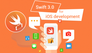 A new, innovative programming language created for iOS and OS X, Apple’s Swift is extremely interactive & fun to use. As Swift code works along with Objective C, you can consider it for addition to your existing app or simply for your iOS and OS X project.
 Seize the opportunity in mobile applications with the new Windows OS and leverage the elegant UI design for a futuristic experience. Estatesonline brings you extensive experience to use Windows to your best advantage and generate maximum adoption of the technology. We are here to empower your objectives in delivering higher returns and reducing costs.
 Magento is a noteworthy eCommerce solution, which provides an exclusive, yet flexible platform for developers, where they can simply control the presence, functionality, and content of your online store. Its extensive features provide complete command over online store operations to merchants, which is really essential for the growth of your online stores. Our Magento developers are up-to-date with the latest technologies, including PHP Programming, JavaScript Programming, etc., as well as extensive experience in Magento website development. They can easily perform Custom Theme Designing, Widgets and Special Effects, XHTML/CSS Enhancements, PSD to Template Development, etc., in Magento designing.
 Magento 2 is the finest incarnation of the eCommerce world, and our highly experienced development team is at your service to provide a robust online store with our Magento 2.0 migration and development services. This platform is includes a large number of flexible tools that cover all of your advanced marketing and catalog-management needs. Hire us, and our experienced professionals will go to work for your online store development needs, ensuring a one-stop solution.
 Magento Enterprise Edition provides online merchants with the much-desired unprecedented flexibility & control over the content, functionality and overall appearance of their e-commerce store.
 PrestaShop is a very powerful platform, and part of its power lies in the fact that it is very easy to build upon and expand through modules and overriding code. Our prime objective is to provide professional, adaptable, robust and reliable Prestashop web development services and supports to our valuable clients at cost-effective manner.PrestaShop is written mostly in PHP. Other languages used throughout are JavaScript, HTML, CSS, the Smarty templating language, SQL, and XML. It uses a Model-View-Controller (MVC)-like pattern for its software architecture. Additionally, it uses technologies such as jQuery, Bootstrap, Sass, etc.


 Talk with us at Estatesonline about how we can provide exclusive and cost-efficient custom made shopping cart development services. Our shopping cart professionals are innovative and employ major web app development platforms PHP, ASP.NET, and much more to deliver the best shopping cart solution for your business requirements. As a leading shopping cart development firm, we customize the most popular eCommerce solutions to meet our clients’ diverse needs. Now, your online store and eCommerce shopping cart can look truly extraordinary. Contact us to provide top-notch eCommerce shopping cart development services.
 Estatesonline offers unmatched WooCommerce online store development services that are a perfect blend of exclusive and power-packed features developed in WooCommerce codes. The world-accepted eCommerce solution, ‘WooCommerce’ delivers an exciting range of features to your WordPress site.
 A world accepted eCommerce platform, nopCommerce has evolved with a multitude of features. The nopCommerce platform is quite flexible, reliable, adaptable, and appealing. The platform is powered by Microsoft’s ASP.NET framework and SQL Server and has a powerful admin panel with business-driven features like product management, catalog management, coupon management, customer management, and much more.
 The open source shopping cart solution ‘BigCommerce’ offers a secure and reliable eCommerce store development platform from small-scale enterprise to large-scale enterprises. This search engine oriented eCommerce solution contains exceptional marketing tools, competitive features, smart plug-ins, and has an exceptional ability to manage high volume website traffic impressively.
 An open source eCommerce platform, ‘Virto Commerce’ design and development is highly impressive with high-end flexibility and reliability. This robust platform is completely backed by Microsoft.Net technology with MS SQL database. Virto Commerce is truly helpful in online shopping cart integration and is specially designed for fast-growing brands. The platform is completely customizable and based on .Net 4.5 and advanced technologies like MVC5/Razor, WPF, HTML5, AngularJS, and much more. It offers a built-in enterprise solution to build out-of-the-box eCommerce solutions.
 Shopify is one of the best eCommerce solutions for web development. Basically, it provides numerous specific professional templates and custom Shopify themes in order help you design your very own online store, which can also be customized according to your requirements. Its ultimate built-in website optimizer feature helps your store show up in top search engine results. With this feature, your customers will find and browse your store and shop – even from smart devices. It not only enhances your store’s popularity, but also provides a stage for you to view and manage all the essential information about your shops such as products, orders, sales statistics, and customer data from your mobile devices.