

A lot of people take website accessibility for granted. The problem is, not everyone experiences the web in the same way. More importantly, some disabilities make browsing a site more complicated than you might imagine.
If you want as many people as possible to be able to enjoy your website, website accessibility testing is a necessity. In this article, we’re going to talk a bit more about
Why Accessibility Testing Matters
The more accessible your website is, the easier it’ll be for all types of users to navigate it.
Website accessibility testing is the process of evaluating your website to ensure it’s usable by people with disabilities. For example, if you use a color palette that makes it difficult for a colorblind individual to navigate your website, proper accessibility testing should detect it.
The primary goal of accessibility testing is to ensure as many people as possible can enjoy your website. However, it’s not an entirely altruistic pursuit since you benefit from it as well. Here’s how:
- It enables you to reach users you otherwise wouldn’t. The better optimized your website is for users with disabilities, the more people you can reach. Those audiences can add up, even if they make up for a low percentage of the population.
- It shows professionalism. Not a lot of people go the extra mile when it comes to accessibility. This means any improvements you make show you’re committed to providing a better experience.
In most cases, it’s not possible to create an accessible website for everyone. However, it is possible to improve the experience for a lot of people by making a few simple adjustments to your website’s design.
Before we dive into the specifics, we recommend you take a look at the Web Content Accessibility Guidelines (WCAG) put together by the World Wide Web Consortium (W3C). In case you’re not familiar with the W3C, it’s an international community that works to develop web standards for better experiences.
To be fair, the WCAG can be a somewhat dry read, but spending some time going over it is the best way to learn more about accessibility standards. In the next section, we’ll go over several concrete steps to test and improve your website’s usability, and explain why they’re essential.
How to Evaluate (And Improve) Website AccessibilityWith Testing (In 4 Steps)
There are a lot of online tools you can use to quickly test whether your website complies with the WCAG. However, these types of tools miss a lot of things you can only find out through thorough testing. They’re excellent starting points, but using them doesn’t constitute proper accessibility testing. With this in mind, let’s get into specifics.
Step #1: Test Your Website For Issues With Color Vision Impairment
A somewhat significant part of the population has difficulty differentiating between colors due to physical issues. This disability is known as color blindness and it’s more prevalent in males.
As you might imagine, color blindness can make it difficult to navigate a website in some cases. For example, people often use contrast in web design to highlight essential elements in a page. Someone with color blindness might not see much of a difference depending on the colors you use. In some extreme cases, people might only be able to perceive things in shades of gray, which is called ‘complete monochromatism’.
Naturally, designing around complete monochromatism is near impossible. What you can do is optimize your website, so it’s accessible for the most common forms of color blindness, which target red and green, followed by blue and yellow. Your first step should be to use a tool such as the

To use the tool, just paste the URL you want to test within the Type a URL box, then choose a filter from the menu to the right. This includes options for three distinct types of color

For the best possible results, you’ll want to render the page you’re testing using each filter separately. Then, check if any of your page’s elements become harder to make out for users with the specific form of color blindness. If you find there are elements you need to rework, the key to making them more accessible is to simply increase their contrast, which is often down to picking the right colors.
Step #2: Check For Issues That Affect Users With General Vision Impairment
There are plenty of visual disabilities unrelated to colors. Nearsightedness, for example, causes difficulties with seeing objects far away, making them look blurry. Cataracts, on the other hand, can render your vision cloudy, as if you were looking through a frosted window.
If you can’t focus on elements based on their distance, you can optimize a website’s design to take that into consideration (within reason). On the other hand, if you suffer from a condition that obstructs your vision, it’s more difficult to deal with.
However, there aren’t many tools you can use to simulate what it’s like to experience a website as if you suffered from farsightedness. Our favorite is a Chrome extension called NoCoffee, which enables you to place filters over every page you see and tweak them as much as you want:

The bad news is there aren’t any other tools that pack in as much functionality as NoCoffee for other browsers. However, Google Chrome is available for all major platforms, and its Developer Tools always come in handy.
Once you install the extension, you can click the icon on your menu, then enable the Blur filter. This way, you’ll be able to practically experience what users with farsightedness see when they visit your site. In most cases, there are only two things you can do to improve their experience:
- Make better use of contrast, as we discussed during step number one.
- Increase your font size so your text is easier to read, even for people with visual impairments.
Naturally, there’s only so far you can go when it comes to text size before it affects your website’s design negatively. For example, in this screenshot, you can see the titles of our blog posts, but not their synopses:

We could increase those text sizes, but
Step #3: Add Descriptive ‘Alt’ Attributes to Your Images For Visually Impaired Users
Alt attributes – or ‘tags’ – are elements describing the contents of an image. Search engines can use the information to figure out what an image is about and better understand it’s surrounding content.
More importantly, alt text enables visually impaired users to understand what the images in your content
In short, any image you add to your posts and pages should include descriptive alt tags. Take this flower, for example:

If you were in a hurry, you might just type “a flower” as the image’s alt tag. However, it’d be far better to go with an option such as “A red flower in the middle of a field”. Of course, there’s such as thing as being too descriptive, and there are cases where a short alt tag will suffice. However, generally speaking, longer descriptions will improve the experience for visually impaired users.
As you may know, WordPress enables you to tweak your image’s alt tags easily. Simply pick an image, either from your media library or within a post or page, and click on its Edit button. On the next screen, look for the Alt Text field, and type your description:

Now save the changes and you’re all set. Remember though – this is a process you need to go through for every image on your website. It can seem like a lot of work, but over time, it’ll become second nature.
Step #4: Review Your Video’s Captions
So far, we’ve focused entirely on visual disabilities, because most websites are consumed through the eyes, so to speak. However, nowadays it’s common for sites to use video content within some of their pages, which brings up the issue of having to deal with auditory disabilities.
Optimizing video for people with visual impairment is out of your hands, in most cases. However, what you can do is ensure your audio is easy to understand. Some of your users may be hard of hearing, in which case, you’ll need to resort to captions.
Adding captions to your videos is the most efficient way to ensure the hearing impaired can still get the most out of your content. However, it can be a lot of work to caption even short videos fully. If that’s something you can’t do, you can always try out features such as YouTube’s closed captioning tool:

Of course, if you’ve looked at any video captioning features. you’ll know the technology isn’t perfect. However, it’s a valid option if the alternative is not having any captions. If you upload your videos to YouTube, WordPress will enable you to embed them on your website just by pasting their link practically anywhere within your posts and pages:

This way, your users can choose to turn on closed captioning if they need to. However, keep in mind that if a lot of your content revolves around video, it’d be wise to start looking into dedicated captioning options. That way, you’ll ensure your content is represented accurately and hearing impaired users can enjoy it.
Conclusion
Accessibility is not something a lot of people consider while working on their website’s design. However, it’s an important factor to take into account if you want to provide an optimal experience for your users. Plus, making your website easier to use won’t only benefit users with disabilities, but your entire audience.
The most efficient way to dive into accessibility testing is to check out the WCAG so you have an idea of what you should aim for. Then, follow these four basic steps to tackle the primary accessibility issues you might run into:
- Test your website for issues with color vision impairment.
- Check for issues that might affect users with general vision impairment.
- Add descriptive alt attributes to your images.
- Review your video’s captions.
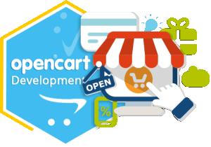 Among the various shopping cart solutions available nowadays, the eCommerce shopping cart software OpenCart is indeed the most user-friendly tool known. Besides offering a simple-to-use yet visually appealing interface to e-commerce portals, it provides almost everything to transform a simple e-commerce site into a sales-attracting one. Following are the benefits it offers
 Estatesonline is a leading web design and development company providing effective e-commerce solutions to global clients. We combine our industry experience and technical skills to provide state of the art e-commerce solutions that help our clients reap maximum benefits from their Internet investment.
 JavaScript-based technology, MEAN stack is widely used by developers to build hybrid and feature-rich web apps. It is the combination of four powerful software development components that are MongoDB, Express.js, Angular JS and Node.js. These software components can be used effectively to design front end and back end development. It can improve the functionality of your website or app.


 Joomla, a power packed content management system (CMS) is loaded with award-winning features. It enables the developers to build dynamic websites and business-centric online applications. Whether you need to create a highly complex website or an enterprise level solution, Joomla has thousands of free plugins and beautiful templates to meet your personalized business needs.
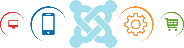

 At EstatesOnLine, you’ll find knowledgeable, experienced Drupal developers for rendering truly out of the world CMS solutions to businesses – both big and small. We have the technical knack and right skills to exploit the powerful and friendly content management platform known as Drupal for building virtually any kind of website for representing your business on the web.
 HTML is great.for declaring static documents, however, when we use HTML for declaring dynamic views in web apps, it falters. Even other frameworks are unable to address the root issue that HTML is not meant for dynamic views. Luckily, AngularJS enables you to extend HTML vocabulary for your web app, thus providing an environment that is extraordinarily expressive and quick to develop. It serves as a tool-set for creating the framework that is most suited to your web app development. This fully extensible tool-set works nicely with other libraries and allows features to be modified/replaced according to your unique development workflow.
 EstatesOnLine is leading name in Symfony Web Development services. Symfony, one of the oldest PHP frameworks, has proved its importance over the years. We have a dedicated team of Symfony developers to meet your projects’ requirements in the most efficient manner. As a Symfony web development company, we do not leave a single stone unturned in delivering competitive edge applications based on this demanding PHP framework. Our developers have in-depth expertise in developing Symfony2 web applications.
 CakePHP has been a favorite for businesses due to its exceptional features & ease of use. If you are looking for the best CakePHP development services that can provide custom CakePHP solutions tailored to your requirements, then your search ends here.
 Being one of the best open-source PHP based web app frameworks, Laravel development is quicker and blessed with MVC architectural pattern. Laravel has been recognized as one of the best frameworks for the development of high-quality websites and trending web applications. This framework is most suitable for developing high performing and creative web apps to meet customized business requirements.
 A leading name in the CodeIgniter web development services, EstatesOnLine is committed to offering appealing and secure websites using the CodeIgniter framework. With years of experience and diversity in PHP-based projects, our CodeIgniter development team is dedicated to implementing the powerful features of this demanding PHP framework in delivering business-oriented web applications.
 Yii is a high-performance, secure and feature-rich PHP framework, used especially for the creation of Web 2.0 applications. It is an object-oriented programming platform having incredible features like MVC, DAO/ActiveRecord, web services, scaffolding, automatic code generation, error handling, role-based access control, and much more that can effectively reduce development time and increase business productivity.
 Powered by Microsoft technology, SharePoint is one of the finest web application development platforms that can be used to develop a full-featured content management system, solid intranet portals, multilingual enterprise solution, and business intelligence; including system integration and process integration. At EstatesOnLine, we are experienced in delivering the best Microsoft SharePoint Development services to global clients.
 Zend has become one of the most popular PHP frameworks. With the increasing popularity of Zend framework, there has been a tremendous demand for expert Zend framework developers. Developers at EstatesOnLine, have years of expertise in Zend framework development. We are a dedicated destination for Zend development services. With our proficiency in being a client-oriented Zend development company, we are now a leading name in the industry.
 Python is one of the finest and most easily readable programming languages that can be integrated easily with other powerful platforms. This platform allows professionals to express core concepts just in fewer lines of code. It is integrated with a dynamic type system and automated memory management. Our team of software professionals provides modern programming solutions in the Python programming language. Our Python-based solutions help our clients achieve their business objectives with full confidence.
 Xamarin development has gained global recognition. Xamarin has a great efficiency to reuse .Net libraries code for building apps. Our developers focus on building multi-platform apps by applying the finest software development solutions like Xamarin Platform, Xamarin Insights & Xamarin Test Cloud.
 A brand new technology, React Native is the cross-platform mobile app development solution for iOS and Android. With the launch of this advanced technology, the huge mobile app development industry is transforming and providing ultimate speed and efficiency to their services at lower costs.
 PhoneGap is undoubtedly one of the most powerful and feature-rich cross-platform app development solutions available in this fast-paced growing technological world. It has an abundance of features and empowers app developers to build and execute custom-made mobile applications in a compressed timeframe. It makes this achievable by providing reusable programming codes, saving considerable development hours as well as reducing costs.
 Our developers create beautiful and appealing hybrid mobile apps using HTML5 and AngularJS on the Ionic platform. With veteran Ionic developers, we build feature-rich mobile apps that are robust and scalable. Contact us for front-end mobile development services on the Ionic platform for iOS, Android, and Windows mobile operating systems.
 The iOS developers at Estatesonline are well-experienced with all the latest techniques of app development. iPhone application development has simplified the complex business processes and communication needs by condensing the controls to trendy Apple devices.
 Understanding the popularity of Android apps, we are committed to developing the best-featured mobile apps to deliver an ultra-modern digital approach to your business. Our years of expertise has made us a prominent player in the Android app development industry. Being well-versed in the nuances of Android over the years, we implement its highly useful features to represent your business to users of Android devices. Our expert developers are ready to enable your app with social media integration, offline capabilities, gamification features, a well-placed feedback system and many more enthralling features to bring a next level experience to your targeted audiences.
 The newest & hottest technology on the block, Google’s Android Wear, extends Android to wearables. A variant of Google’s Android operating system, Android Wear can pair with Smartphones that operate on Android version 4.3+ to enable integrating Google Now functionality & mobile notifications into Smartwatch form factor. It enables you to –
 Estatesonline extends competitive iPad application development services to help iPad users get the most out of their 3G/4G gadget. Not one, but many reasons are there for you to choose us for your bespoke iPad application development needs. Here are just a few:
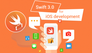 A new, innovative programming language created for iOS and OS X, Apple’s Swift is extremely interactive & fun to use. As Swift code works along with Objective C, you can consider it for addition to your existing app or simply for your iOS and OS X project.
 Seize the opportunity in mobile applications with the new Windows OS and leverage the elegant UI design for a futuristic experience. Estatesonline brings you extensive experience to use Windows to your best advantage and generate maximum adoption of the technology. We are here to empower your objectives in delivering higher returns and reducing costs.
 Magento is a noteworthy eCommerce solution, which provides an exclusive, yet flexible platform for developers, where they can simply control the presence, functionality, and content of your online store. Its extensive features provide complete command over online store operations to merchants, which is really essential for the growth of your online stores. Our Magento developers are up-to-date with the latest technologies, including PHP Programming, JavaScript Programming, etc., as well as extensive experience in Magento website development. They can easily perform Custom Theme Designing, Widgets and Special Effects, XHTML/CSS Enhancements, PSD to Template Development, etc., in Magento designing.
 Magento 2 is the finest incarnation of the eCommerce world, and our highly experienced development team is at your service to provide a robust online store with our Magento 2.0 migration and development services. This platform is includes a large number of flexible tools that cover all of your advanced marketing and catalog-management needs. Hire us, and our experienced professionals will go to work for your online store development needs, ensuring a one-stop solution.
 Magento Enterprise Edition provides online merchants with the much-desired unprecedented flexibility & control over the content, functionality and overall appearance of their e-commerce store.
 PrestaShop is a very powerful platform, and part of its power lies in the fact that it is very easy to build upon and expand through modules and overriding code. Our prime objective is to provide professional, adaptable, robust and reliable Prestashop web development services and supports to our valuable clients at cost-effective manner.PrestaShop is written mostly in PHP. Other languages used throughout are JavaScript, HTML, CSS, the Smarty templating language, SQL, and XML. It uses a Model-View-Controller (MVC)-like pattern for its software architecture. Additionally, it uses technologies such as jQuery, Bootstrap, Sass, etc.


 Talk with us at Estatesonline about how we can provide exclusive and cost-efficient custom made shopping cart development services. Our shopping cart professionals are innovative and employ major web app development platforms PHP, ASP.NET, and much more to deliver the best shopping cart solution for your business requirements. As a leading shopping cart development firm, we customize the most popular eCommerce solutions to meet our clients’ diverse needs. Now, your online store and eCommerce shopping cart can look truly extraordinary. Contact us to provide top-notch eCommerce shopping cart development services.
 Estatesonline offers unmatched WooCommerce online store development services that are a perfect blend of exclusive and power-packed features developed in WooCommerce codes. The world-accepted eCommerce solution, ‘WooCommerce’ delivers an exciting range of features to your WordPress site.
 A world accepted eCommerce platform, nopCommerce has evolved with a multitude of features. The nopCommerce platform is quite flexible, reliable, adaptable, and appealing. The platform is powered by Microsoft’s ASP.NET framework and SQL Server and has a powerful admin panel with business-driven features like product management, catalog management, coupon management, customer management, and much more.
 An open source eCommerce platform, ‘Virto Commerce’ design and development is highly impressive with high-end flexibility and reliability. This robust platform is completely backed by Microsoft.Net technology with MS SQL database. Virto Commerce is truly helpful in online shopping cart integration and is specially designed for fast-growing brands. The platform is completely customizable and based on .Net 4.5 and advanced technologies like MVC5/Razor, WPF, HTML5, AngularJS, and much more. It offers a built-in enterprise solution to build out-of-the-box eCommerce solutions.
 Shopify is one of the best eCommerce solutions for web development. Basically, it provides numerous specific professional templates and custom Shopify themes in order help you design your very own online store, which can also be customized according to your requirements. Its ultimate built-in website optimizer feature helps your store show up in top search engine results. With this feature, your customers will find and browse your store and shop – even from smart devices. It not only enhances your store’s popularity, but also provides a stage for you to view and manage all the essential information about your shops such as products, orders, sales statistics, and customer data from your mobile devices.